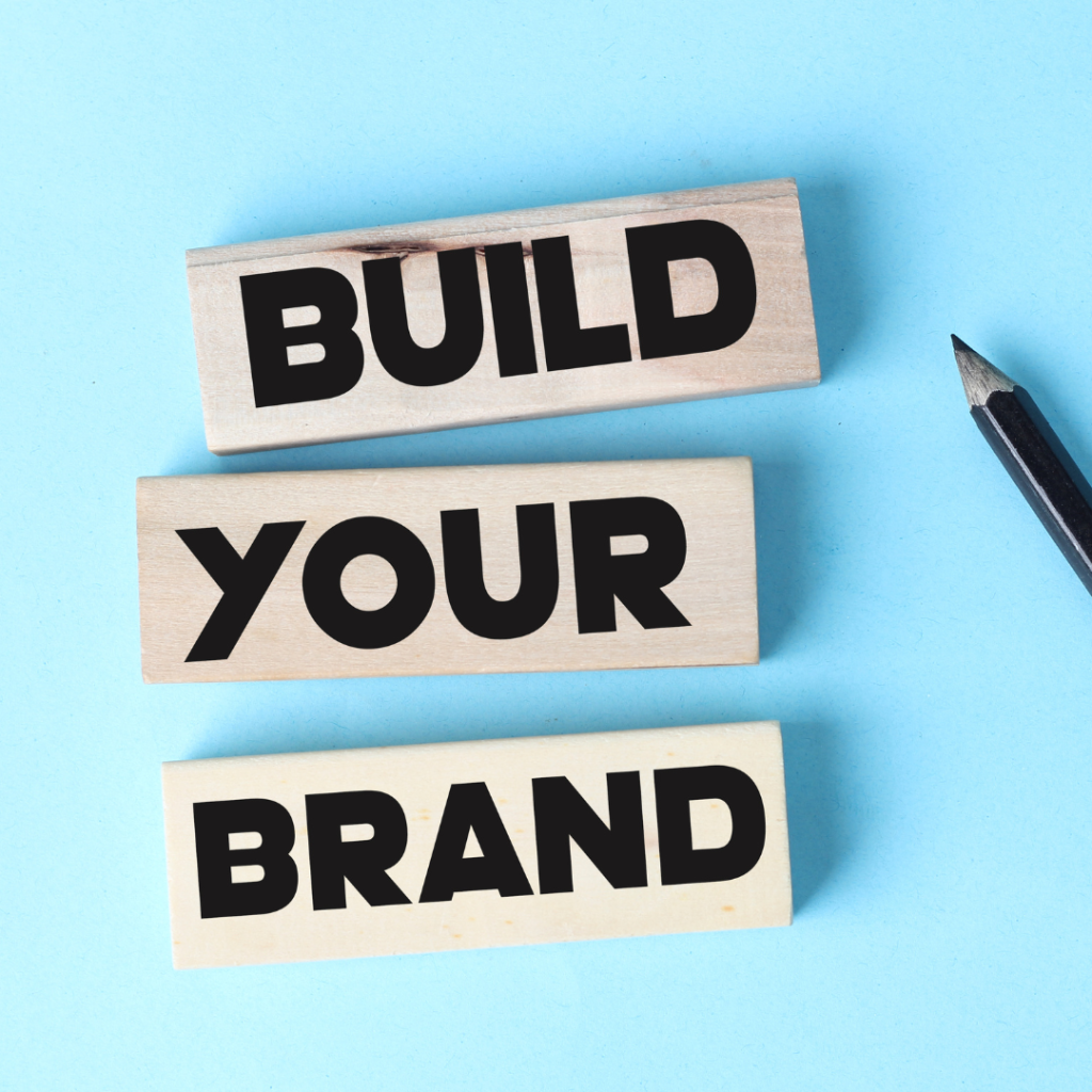
Having clarity on your branding when starting your business is absolutely essential. It has to be clear, engaging, and memorable for potential customers.
A clear and memorable brand stands out in the minds of potential customers. When your brand is easily recognizable, it fosters a sense of familiarity and trust. This recognition becomes a powerful asset, especially in a competitive market where consumers are bombarded with choices.
Your branding is crucial to the success and sustainability of your business, and if done right, it will persuade potential customers to choose you over your competitors.
In a crowded marketplace, having a distinct and clear brand sets you apart from competitors. It’s not just about what you offer but how you present it.
When defining your branding, you must consider whether it’s:
- Memorable – the way your business is presented online and offline needs to pack a punch. It needs to be something that stands out from the crowd and sticks in peoples minds whether this be through colour, wording, imagery etc.
- Engaging – your branding needs to catch the attention of potential customers. Think of it like this. If you were walking down the street and saw your brand on a billboard, would it make you stop and look? Would it make you want to learn more about the business?
- Tailored to your client avatar – of course, your business is YOUR business. Ultimately it’s up to you how you brand it. But, it needs to be tailored in the right way to attract your ideal client. Consider whether it matches your business offers and whether it’s designed to catch the eye of the kind of people you want to work with and/or sell to.
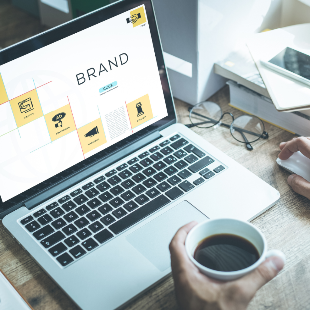
What are some of the key elements of your branding?
-
Logo
The logo you design or choose for your business is arguably the most important aspect within branding. It’s usually the first thing that potential clients and customers will see, and if it doesn’t appeal to them, they’ll likely be inclined to look elsewhere for the same product or service.
Your logo should be simple, stripped back, and should be designed in a way for a potential customer to figure out what they’re looking at pretty much instantly. -
Colours
What kind of colour palette do you use for your business? Is it eye-catching? Does it attract the right kind of people? When choosing your colour palette you must make sure that it’s not only memorable, but that it also matches your tone.
Think about it, let’s take a nursery for example. If the branding was dull, with greys and whites, that doesn’t exactly match the kind of tone/environment a nursery should have.
For my business I use black, white, and hot pink. It’s simple and makes things easy to read, but the pink makes particular parts stand out. Since it’s so vibrant it will be easy to remember and recognise within a crowded market. -
Tagline/Slogan
A tagline or slogan is a short, straight to the point, and memorable phrase or statement that usually follows straight after the business name. For example, Tesco’s tagline would be ‘Every Little Helps’. It’s short, sweet, and catchy so it sticks in people’s minds.
When coming up with a slogan for your business, it should match the same criteria. Keep it short and punchy, but make sure it’s relevant to your business. It could be about the products and services you offer, or summarise the kind of beliefs and values of the business. Get creative! -
Themes (shapes, fonts etc).
The kind of themes that you use to tie in with your logo and color palette. When I say themes I’m talking on your website, on promotional visuals and infographics etc.
Think shapes. If your business is very bubbly and upbeat, softer and more rounded shapes would likely be a good fit. But if your brand is much more ‘in your face’ and straight to the point, bigger and sharper shapes that pack a punch would be more suitable.
Fonts should be the same! The fonts you choose should coincide with the rest of your branding and match the designs. They should reflect your brand’s tone and appeal to your target audience. Make sure they’re consistent throughout. Consistency is key. -
Imagery and Photos
Don’t forget photos! When thinking of imagery, it’s not just about your logo. The kind of photos you use on your website like in blogs and on your homepage should be consistent with the rest of your branding. Things like stock images and non-copyrighted photos should always be included somewhere within your website. It breaks up text and makes it easier on the eyes.
Not only photos, but imagery also includes things like your designs and backgrounds for infographics, visuals, and promotional material. It ties in nicely with shapes and colours.
This business was not always JVB!
If you’ve known me for a long time, you’ll know that we will be rebranded in 2020.
Originally I started this business in 2016, under the name ‘The Unique Mumpreneur’. As a mother and woman in business, I wanted to start mentoring other mothers who wanted to grow their own businesses and take control of their lives. I chose this name because in 2014 I was awarded ‘The Unique Award’ and The Small Business Awards. And then of course if you hadn’t guessed, ‘mumpreneur’ is a combination of mum, and entrepreneur!
This was great for the time, as my ideal client was literally, mums who wanted to become business owners.
But as our audience grew and we started to work with a much wider range of clients, I thought it was best to rebrand to be more inclusive to anyone who wanted to become a business owner.
So since then we have been known as Jo Bevilacqua Mentoring and I have offered all of my services under this brand.
Rebranding was such a huge thing to do, but if you feel it’s right for your business and you will benefit from it then absolutely go for it.
Your branding can be the make or break of your business!